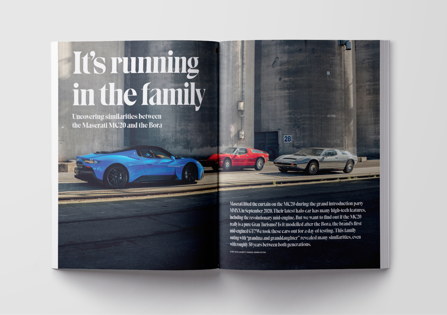
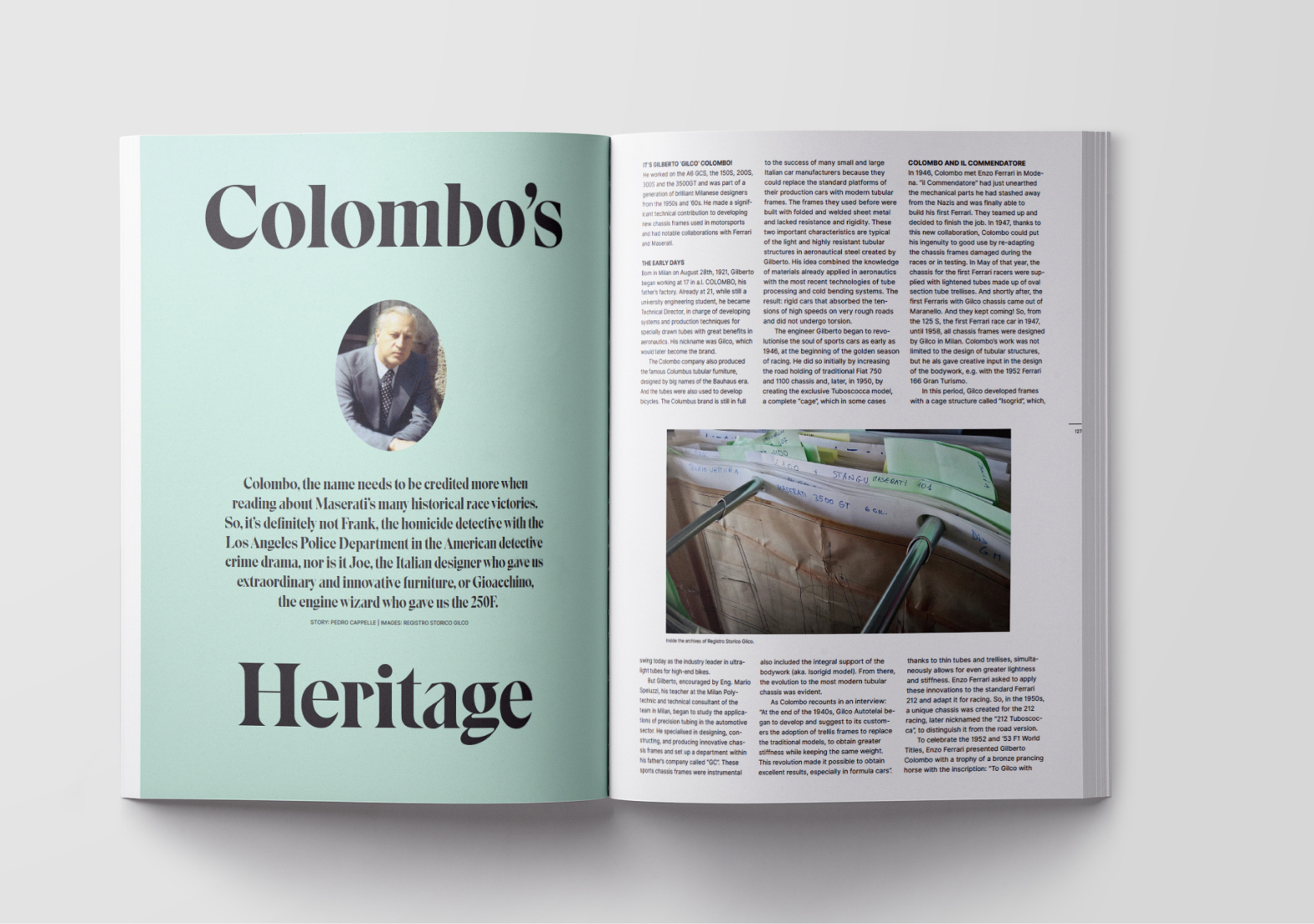
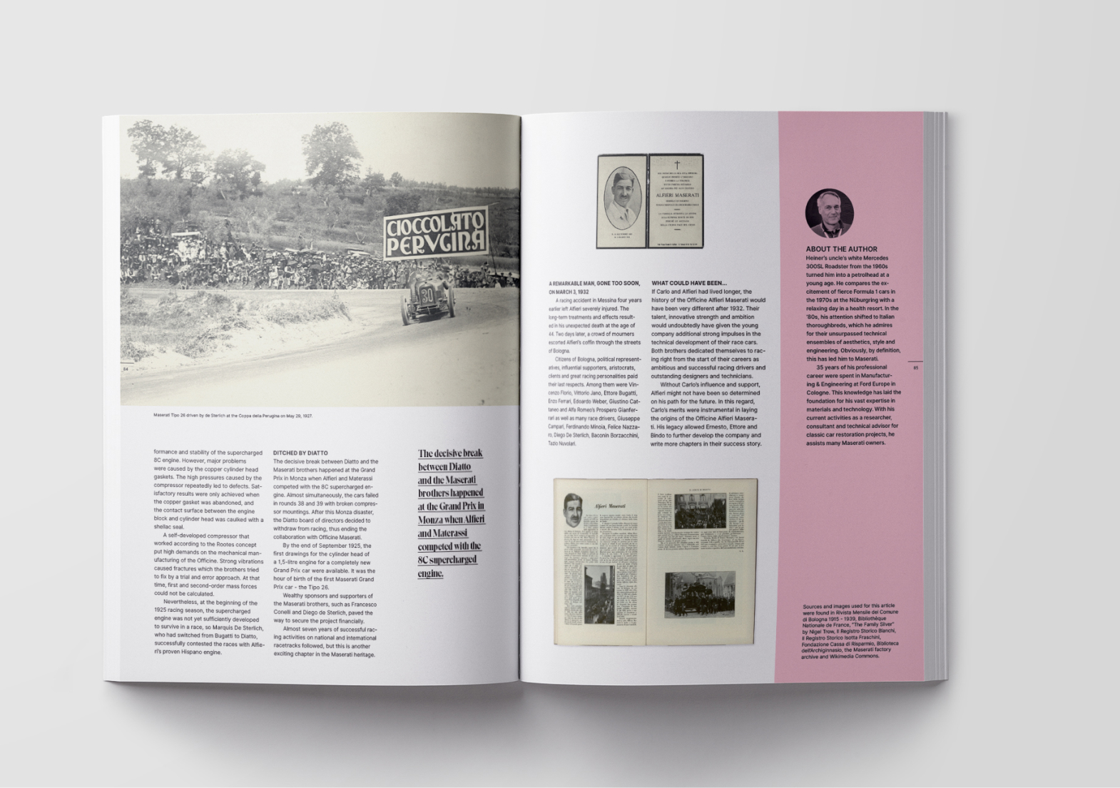
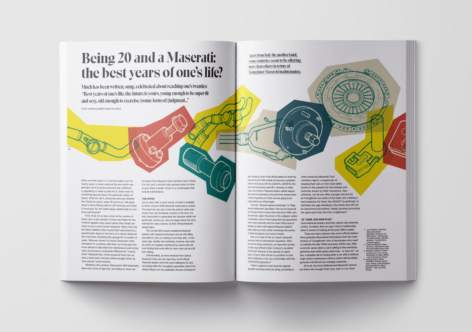
Alfieri – Maserati Magazine
Alfieri magazine, an independent publication for and by Maserati enthusiasts, is tapping into the next generations of Maserati owners, whether they like classic cars or favour current models.
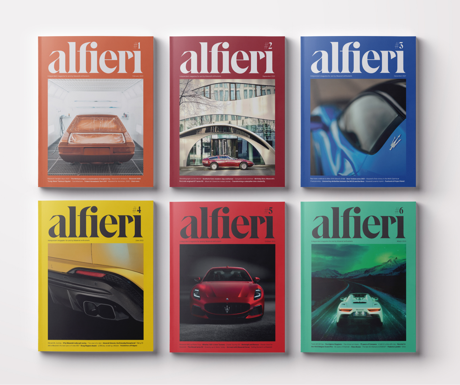
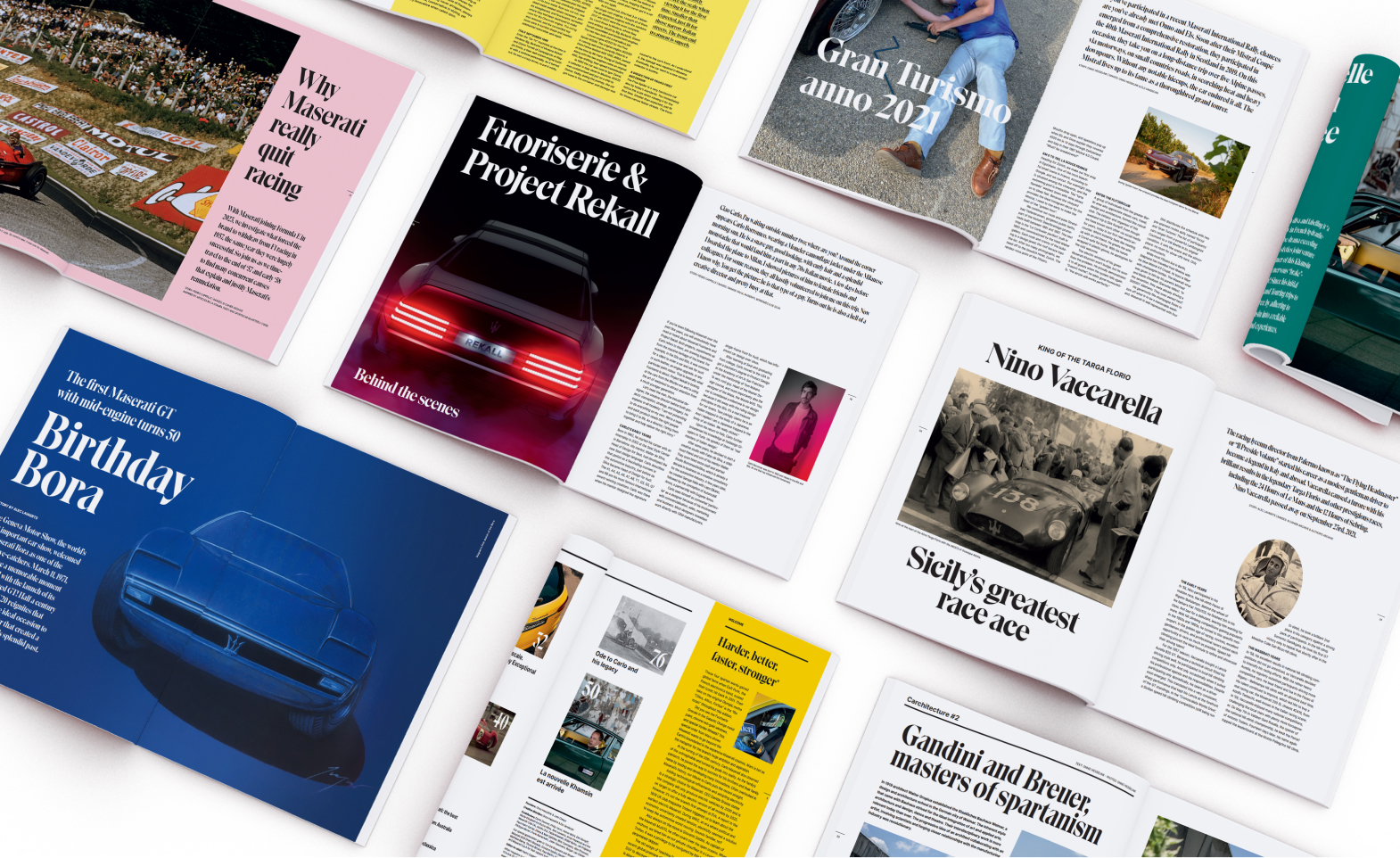
Presented as a limited edition collector’s item, Alfieri dives into the glorious past and discovers the exciting future of Maserati, with a strong emphasis on photography, design, lifestyle and architecture. The magazine draws inspiration from interactions with the Maserati community and international clubs. Alfieri delivers unique and relevant content in a contemporary way, focusing on photography, graphics, design, architecture and lifestyle.
The typography and page layout of the magazine refers to sales brochures of Italian car brands from the 50s, 60s and 70s and is topped with a layer of contemporary design. This is expressed through the use of two typefaces of strong character. For the headlines and quotes, we chose a relatively old typeface that has only recently been digitized. Eksell Display has a strong face of its own and looks very contemporary. The body copy is set in Inter, a typeface by Rasmus Andersson. An open page layout with plenty of white space combined with large headlines defines the look of Alfieri. This leaves maximum room for the images of both historical photographs and illustrations and modern photography to speak.