Queens Brussels
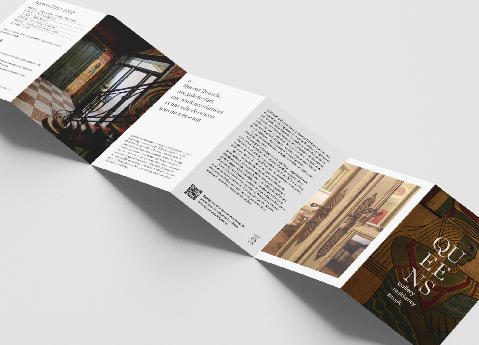
Queens is a newborn gallery, housed in an eclectic building in Brussels. Its objective is to showcase art in an original setting while respecting its authenticity and the history of the mansion with multidisciplinary exhibitions. The space is set up as an art gallery for different forms of artistic expression: painting, photography, sculpture, video, and performance. The gallery’s ambition is to be a space where people can gather around multiple artistic mediums. The special atmosphere of the place, the warm and intimate setting, and its Louis XVI style living room lend themselves perfectly to chamber concerts. In parallel, another space is planned for jazz concerts and jam sessions.
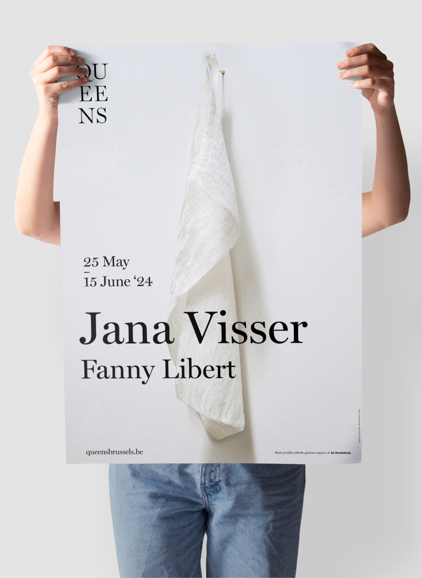
The owners Naik and Sébastien gave us carte blanche to create their brand identity of Queens ground-up. A challenge we happily accepted. The Miller typeface - designed by Carter & Cone - is central to all communication. This elegant, balanced, and also highly legible typeface forms the basis of the logo and everything that flows from it. The result is a contemporary brand identity with respect for the history and uniqueness of the building. The sole purpose of the design - as in all our work – is to serve communication.
To quote the World-renowned industrial designer Dieter Rams, "Good design is as little design as possible. Less, but better." Queens is a name you will hear a lot more of. And will see.